> ## Documentation Index
> Fetch the complete documentation index at: https://docs.chipperg.xyz/llms.txt
> Use this file to discover all available pages before exploring further.
# Appearance
> Choose a preset theme or build your own palette.
Appearance changes the colors used across Chipper. You can choose a preset or customize your own palette.
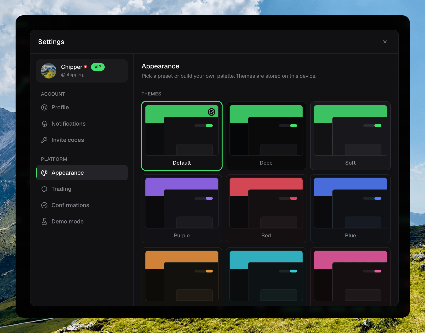
Open your avatar → **Settings** → **Appearance**. Select a theme card to apply it immediately. The token chart updates with the rest of the app.
 Your theme and custom colors stay on this device. They do not sync to your account.
## Preset themes
Chipper includes nine preset themes.
| Theme | Style |
| ----------- | ------------------------------------------------------------- |
| **Default** | The default green theme with balanced dark surfaces. |
| **Deep** | The default green accent with darker backgrounds and panels. |
| **Soft** | The default green accent with lighter backgrounds and panels. |
| **Purple** | A purple primary accent with a subtle violet tint. |
| **Red** | A red primary accent with restrained warm surfaces. |
| **Blue** | A blue primary accent with restrained cool surfaces. |
| **Orange** | An orange primary accent with a subtle warm tint. |
| **Cyan** | A cyan primary accent with a subtle cool tint. |
| **Pink** | A pink primary accent with a subtle rose tint. |
The color presets keep increase and decrease colors consistent. This makes trading signals recognizable when you switch themes.
## Custom themes
You get three custom slots: **Custom 1**, **Custom 2**, and **Custom 3**. Each slot stores a separate palette.
Click **Custom 1**, **Custom 2**, or **Custom 3** in the theme grid.
Click a color swatch to use the picker, or enter a six-digit hex color.
Changes apply immediately across the interface and token chart.
### Interface colors
* **Accent** controls primary actions, selected states, and focus rings.
* **Background** controls the main app surface.
* **Panels** controls cards, dialogs, and popovers.
* **Raised surfaces** controls muted and elevated controls.
* **Borders** controls separators and outlines.
### Text colors
* **Primary** controls the strongest text.
* **Secondary** controls supporting text.
* **Muted** controls low-emphasis labels and descriptions.
### Trading colors
* **Increase** and **Decrease** control positive and negative values.
* **Candle up** and **Candle down** control token-chart candles and related chart marks.
## Switch or reset
Select any preset to leave a custom theme. Chipper keeps the custom slot unchanged so you can return to it later.
Click **Reset** while editing a custom slot to restore that slot to the **Default** palette. The other custom slots are not changed.
Your theme and custom colors stay on this device. They do not sync to your account.
## Preset themes
Chipper includes nine preset themes.
| Theme | Style |
| ----------- | ------------------------------------------------------------- |
| **Default** | The default green theme with balanced dark surfaces. |
| **Deep** | The default green accent with darker backgrounds and panels. |
| **Soft** | The default green accent with lighter backgrounds and panels. |
| **Purple** | A purple primary accent with a subtle violet tint. |
| **Red** | A red primary accent with restrained warm surfaces. |
| **Blue** | A blue primary accent with restrained cool surfaces. |
| **Orange** | An orange primary accent with a subtle warm tint. |
| **Cyan** | A cyan primary accent with a subtle cool tint. |
| **Pink** | A pink primary accent with a subtle rose tint. |
The color presets keep increase and decrease colors consistent. This makes trading signals recognizable when you switch themes.
## Custom themes
You get three custom slots: **Custom 1**, **Custom 2**, and **Custom 3**. Each slot stores a separate palette.
Click **Custom 1**, **Custom 2**, or **Custom 3** in the theme grid.
Click a color swatch to use the picker, or enter a six-digit hex color.
Changes apply immediately across the interface and token chart.
### Interface colors
* **Accent** controls primary actions, selected states, and focus rings.
* **Background** controls the main app surface.
* **Panels** controls cards, dialogs, and popovers.
* **Raised surfaces** controls muted and elevated controls.
* **Borders** controls separators and outlines.
### Text colors
* **Primary** controls the strongest text.
* **Secondary** controls supporting text.
* **Muted** controls low-emphasis labels and descriptions.
### Trading colors
* **Increase** and **Decrease** control positive and negative values.
* **Candle up** and **Candle down** control token-chart candles and related chart marks.
## Switch or reset
Select any preset to leave a custom theme. Chipper keeps the custom slot unchanged so you can return to it later.
Click **Reset** while editing a custom slot to restore that slot to the **Default** palette. The other custom slots are not changed.